TannieSpace

geekery, drawing and then some

Posts about website

Mobile site

Mobile site screenshot

I've tweaked and fiddled a bit, and now have a satisfying version of my website for mobile browsers. It all should just work, with a link to the full site on the top right should you prefer that.

I still want to tweak the layout, the pages list only shows up at the home-page, where it maybe should show up everywhere -- navigation matters. Also the search box shows up at the bottom, but maybe I should move it to the top.

I've added the little snowman to the home-page at least, to sync it with the main site's design.

I have also tried to keep it small. It currently loads at a 135kb for the main-page. Looking into making it less KB (the full version consists of 1MB of files, also trying to make it smaller). Just because a lot of us have fancy speedy connections doesn't mean I should aim for that. I aim for the average speed and hope it doesn't take too long to load either page.

The drawing habit: day 9.

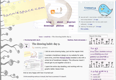
imgI did do some drawing today, just not the regular kind.

I wanted a handdrawn design on my website for quite some time, and then Michael Nobbs tweeted a site with a whole list of handdrawn designs. This of course meant I should get my act together and do it.

I spent the entire day doodling, and working with my graphic tablet. Soooo tired.

And so very happy with how it turned out!

I think everything works as it should, feel free to comment if it doesn't.


New design, new stuff in the background

And there I did it. I switched from Movable Type to Wordpress to manage my site.

It actually went really smooth and I actually like Wordpress so far. No unnecessary complications. Movable Type started acting up on me, not letting me edit post titles. I upgraded and then it wouldn't let me edit post entries anymore. Or post anything new... So I decided to give Wordpress a shot. So far, I like it. :)